6. The Earth-Toned Color Block & Typography Spread
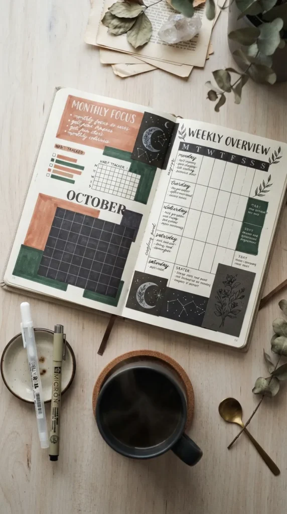
A Scandinavian-inspired design using muted geometric blocks and bold typography.
- Introduction: Clean geometry meets warm terracotta, oat, olive, and clay tones, organizing gratitude entries into structured color blocks.
- What This Idea Means: Color psychology plays a significant role in mindfulness. Warm, grounded earth tones evoke warmth, stability, and peaceful focus.
- How to Make It:
- Create 3 to 4 distinct geometric rectangular sections across the page using muted brush markers (terracotta, warm sand, sage, dusty mauve).
- Inside each colored block, write your gratitude entries using crisp white gel pens or dark charcoal pigment pens.
- Emphasize the first word of each sentence in bold serif lettering.
- Tips & Variations:
- Ensure high contrast between ink color and the background block for easy legibility.
- Leave wide white margins around the color blocks to maintain a modern aesthetic.
- Variation: Use textured, recycled kraft paper scraps pasted into the notebook as the organic background blocks.