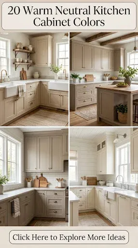
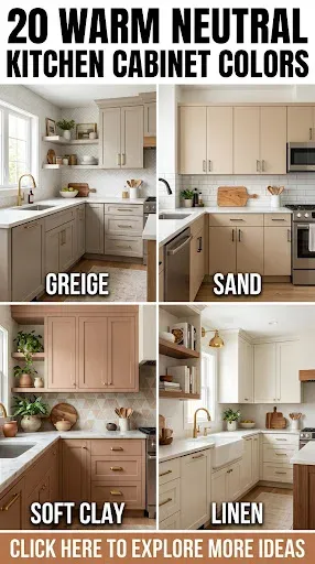
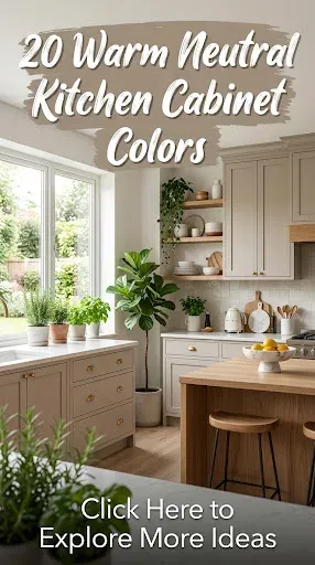
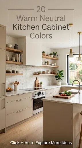
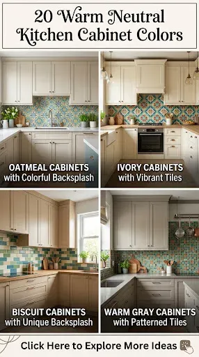
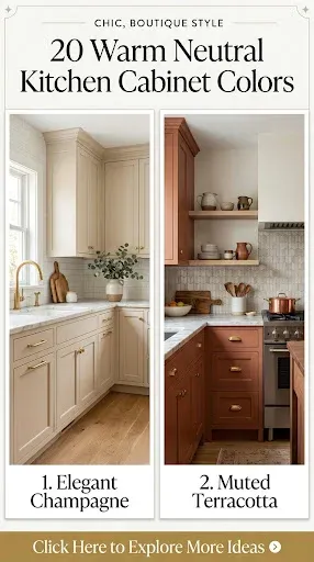
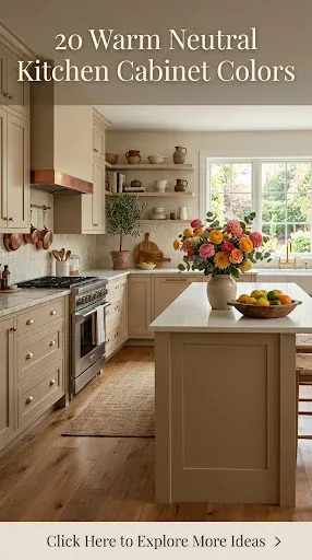
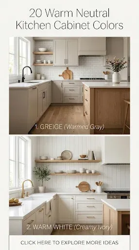
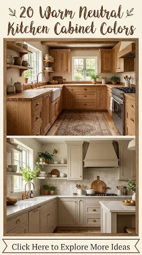
Kitchen design is continually evolving, yet the craving for spaces that feel grounding, inviting, and deeply comforting remains constant. In a world saturated with digital noise and fast-paced trends, the heart of the home is retreating toward a softer, more organic aesthetic. Enter warm neutral kitchen cabinet colors—the ultimate design antidote that bridges the gap between modern minimalism and timeless tradition. Warm neutrals possess a unique alchemy. Unlike stark, clinical whites or heavy, light-absorbing darks, warm neutrals embrace undertones of yellow, red, orange, and soft brown, wrapping a kitchen in a gentle, welcoming embrace. They bounce natural light gracefully while adding structural depth and tactile richness to cabinetry.
Designing a Pinterest-worthy kitchen requires more than simply picking a paint swatch off a shelf; it demands an understanding of light play, textural contrast, and atmospheric harmony. Whether you are aiming for the sun-bleached serenity of a Mediterranean villa, the cozy charm of an English country cottage, or the streamlined elegance of organic modernism, warm neutrals provide the ultimate versatile canvas. This comprehensive guide explores twenty gorgeous, trend-setting warm neutral cabinet colors, complete with actionable application tips, bespoke variations, and visual inspiration blueprints tailored for modern creators and homeowners.
1. Creamy Oat Milk
Oat milk is the modern alternative to traditional bright white, offering a softer, more digestible visual weight that prevents a kitchen from feeling sterile. It carries subtle golden undertones that interact beautifully with morning light, shifting from a crisp, clean ivory in direct sun to a buttery, soothing cream during evening hours. This shade works harmoniously in smaller kitchens because it reflects light extensively, expanding the sense of space without sacrificing warmth.
- How to Make It: Combine a clean titanium white base with a microscopic drop of raw umber and yellow ochre. Aim for a satin or low-sheen eggshell finish to catch light softly without producing a harsh glare.
- Design Variations: Pair Oat Milk cabinets with unlacquered brass hardware, warm white zellige tile backsplashes, and white oak floating shelves to elevate the organic texture.
2. Muted Cashmere
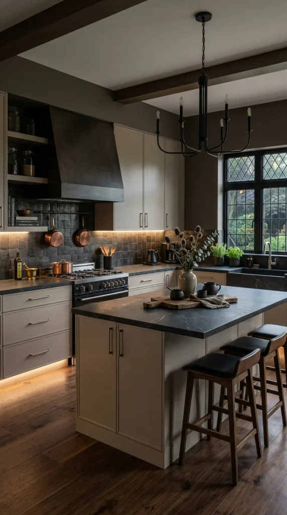
Cashmere is the epitome of understated luxury, sitting gracefully between a soft gray and a warm taupe. It is a chameleon color that adapts to its surroundings, reading slightly cooler in north-facing rooms and wonderfully warm in sun-drenched south-facing spaces. This color brings an immediate sense of tailored sophistication to shaker-style or slab cabinetry, offering depth that flat whites simply cannot achieve.
- How to Make It: Blend a neutral greige base with equal parts soft beige and a whisper of gray tint. Request a fine factory spray finish with a dead-matte or ultra-matte protective topcoat for that velvety, fabric-like touch.
- Design Variations: Contrast Muted Cashmere with charcoal soapstone countertops, brushed nickel pulls, and dark walnut flooring to anchor the room’s color palette.
3. Sun-Warmed Alabaster
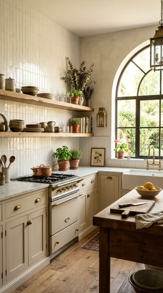
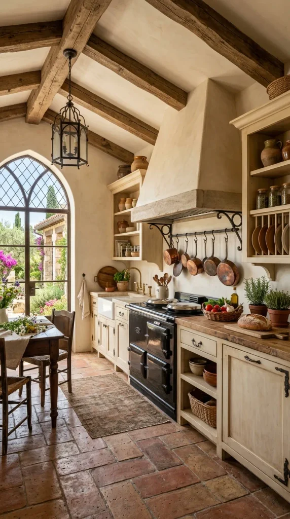
Alabaster traditionally leans clinical, but a sun-warmed iteration introduces a gentle wash of amber and peach undertones. This shade mimics the historic plaster walls found in Mediterranean farmhouses, creating an instant sense of history and lived-in comfort. It serves as an exceptional backdrop for rustic architectural elements and handcrafted finishes.
- How to Make It: Tint a standard warm white base with a heavy measure of yellow-orange pigment and a trace of burnt sienna. Apply using a brush-and-roll technique or a stippled spray method to impart subtle, authentic wall-like texture.
- Design Variations: Style with terracotta floor tiles, antique copper cookware hanging from a rail, and reclaimed chestnut ceiling beams for an authentic rustic aesthetic.
4. Soft Parisian Linen
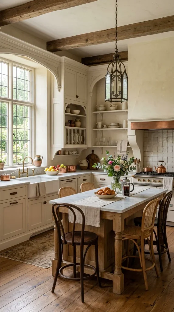
Parisian linen captures the casual elegance of vintage French textiles. It is a dusty, bleached-flax hue that feels airy, breathable, and profoundly calming. This color effortlessly bridges the gap between transitional and traditional kitchen designs, providing a neutral backdrop that allows natural materials like stone and wood to take center stage.
- How to Make It: Mix a soft grey-beige with a generous amount of warm white and a minuscule touch of raw sienna to dial back any coolness. Opt for a chalk-paint style finish lightly distressed along the edges for a timeworn look.
- Design Variations: Combine with honed Carrara marble countertops, French bistro chairs, and aged iron hardware for a timeless Parisian apartment feel.
5. Rich Biscuit Beige
Biscuit beige is a hearty, delectable neutral that leans heavily into comforting brown undertones. Far from the boring builder-grade beige of decades past, modern biscuit beige is deeply saturated, reading as rich, buttery, and substantial. It grounds a kitchen instantly, pairing brilliantly with abundant natural light and organic greenery.
- How to Make It: Combine a deep cream base with prominent doses of raw umber and golden yellow. Choose a durable conversion varnish in a satin finish to withstand heavy daily use while maintaining its rich luster.
- Design Variations: Pair with Calacatta gold marble featuring bold taupe veining, antique brass bridge faucets, and natural jute runner rugs.
6. Toasted Almond
Toasted almond is a sophisticated, nutty neutral that brings an unmistakable warmth and organic richness to kitchen perimeters or kitchen islands. It bridges the gap between beige and light wood tones, making it an ideal choice for homeowners who want color without venturing into bold hues. It radiates hospitality and culinary comfort.
- How to Make It: Blend warm beige with substantial drops of yellow ochre and a touch of red oxide. Apply a semi-gloss sheen to reflect light and highlight cabinet panel profiles.
- Design Variations: Contrast toasted almond lower cabinets with open upper shelving, honey-toned white oak floors, and matte black minimalist hardware.
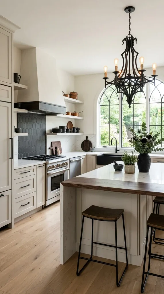
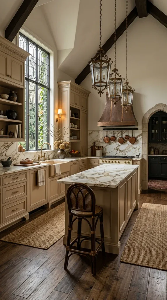
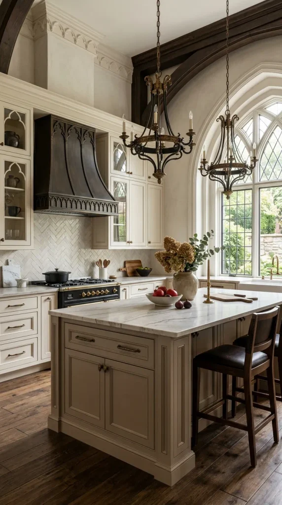
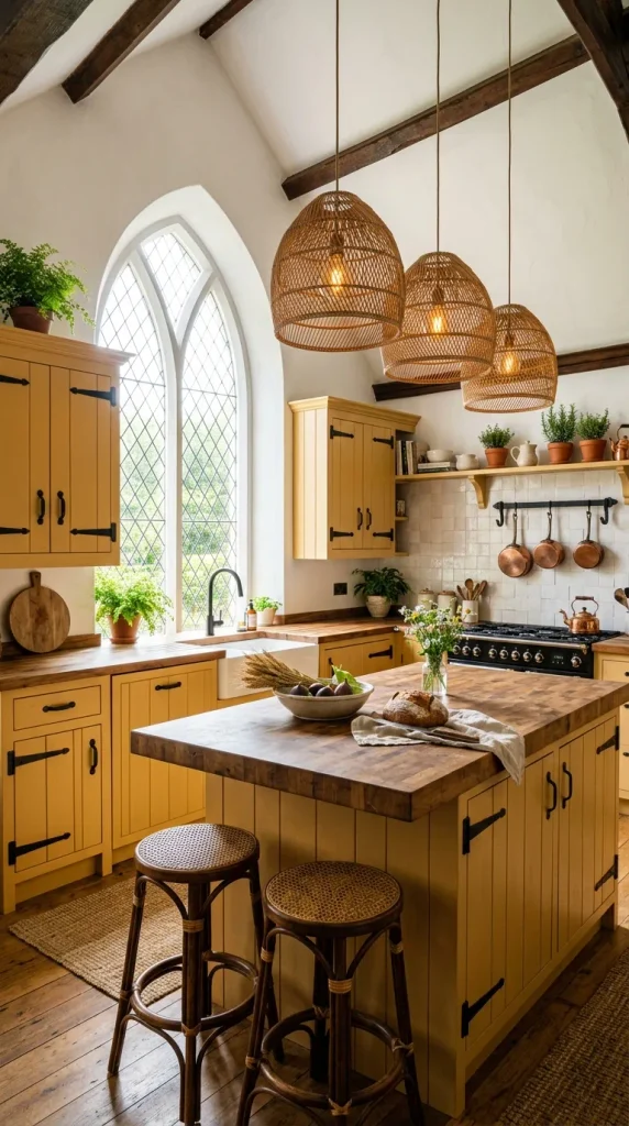
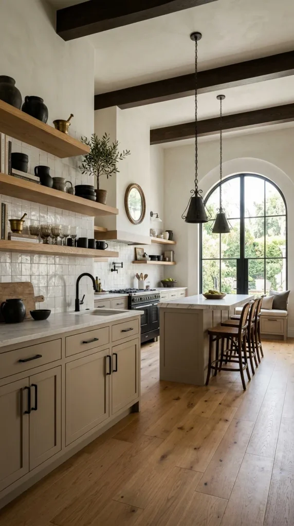
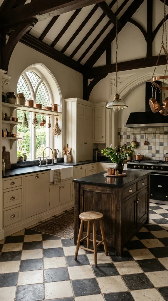
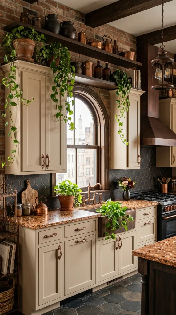
7. Silky Ecru
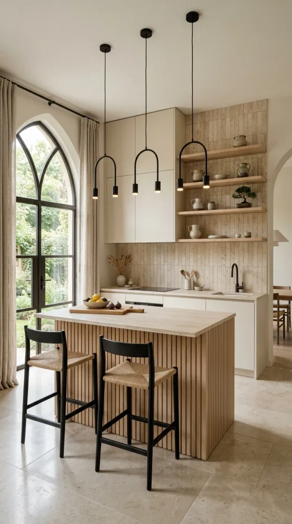
Ecru is the color of unbleached raw silk and natural cotton. It possesses a delicate, creamy warmth with a microscopic hint of yellow-green earthiness that keeps it grounded and modern. Ecru is exceptionally versatile, working wonders in minimalist, Scandinavian, and Japandi-style kitchens where simplicity and natural textures reign supreme.
- How to Make It: Start with a bright white base and tint with raw umber and a drop of yellow oxide until the starkness is completely neutralized into a soft, glowing cream.
- Design Variations: Match with light ash wood slats, vertical travertine tile backsplashes, and minimalist concealed push-latch hardware for a seamless, handleless look.
8. French Vanilla
French vanilla is a classic, rich, buttery neutral that injects vintage charm and welcoming hospitality into any culinary space. It evokes memories of artisanal bakeries and classic country homes. When applied to inset cabinetry, French vanilla delivers an heirloom quality that feels both established and enduring.
- How to Make It: Mix a warm white base with a strong measure of warm yellow pigment and a whisper of burnt umber. Use a professional spray finish to ensure a flawless, smooth-as-silk surface.
- Design Variations: Pair with black honed granite countertops, polished nickel cup pulls, and classic checkered floor tiles in cream and charcoal.
9. Soft Desert Sand
Drawing inspiration from windswept dunes and sun-baked landscapes, soft desert sand is a dusty, pink-kissed neutral that infuses spaces with a gentle, organic warmth. It introduces a subtle, unexpected rosiness without feeling overly sweet or juvenile, making it a sophisticated choice for contemporary urban homes.
- How to Make It: Blend a standard greige with a touch of rose madder and raw sienna. Select a flat matte finish that absorbs light and emphasizes the velvety texture of the paint.
- Design Variations: Accentuate with brushed copper hardware, terrazzo countertops containing warm quartz chips, and trailing pothos plants in terracotta pots.
10. Warm Mushroom Taupe
Mushroom taupe is a masterclass in balance, combining the gray-brown depth of forest fungi with the comforting warmth of sunlit soil. It is currently one of the most sought-after neutral shades for kitchen islands, offering a grounding anchor that contrasts beautifully against lighter perimeter cabinetry or walls.
- How to Make It: Combine equal parts raw umber, yellow ochre, and gray, adjusting until the color reads neither too purple nor too yellow. Apply a durable satin finish.
- Design Variations: Pair with creamy off-white perimeter cabinets, quartzite countertops with subtle gray-brown veining, and aged bronze hardware.
11. Golden Wheat
Golden wheat is a joyful, sun-drenched neutral that brings the vibrant energy of harvest fields indoors. It radiates positivity and warmth, transforming north-facing or dimly lit kitchens into cheerful, inviting sanctuaries. It pairs exceptionally well with natural textures like rattan, stone, and raw wood.
- How to Make It: Mix a white base with a generous quantity of yellow ochre and a small touch of burnt orange. Use a satin or semi-gloss finish to maximize its light-reflecting, sun-like qualities.
- Design Variations: Style with butcher block countertops treated with food-safe mineral oil, black iron strap hinges, and woven rattan pendant lights.
12. Pale Greige
Pale greige is the ultimate diplomatic neutral, seamlessly marrying the clean neutrality of gray with the cozy warmth of beige. It is tailor-made for contemporary homes that require a transitional shade to connect disparate design elements. It provides a clean, modern framework without feeling cold or sterile.
- How to Make It: Blend an equal mix of light gray and warm beige pigments into an acrylic-urethane enamel base. Opt for an eggshell sheen for optimal durability and a soft tactile feel.
- Design Variations: Combine with stainless steel appliances, white quartz countertops featuring delicate linear veining, and sleek matte black pulls.
13. Antique Parchment
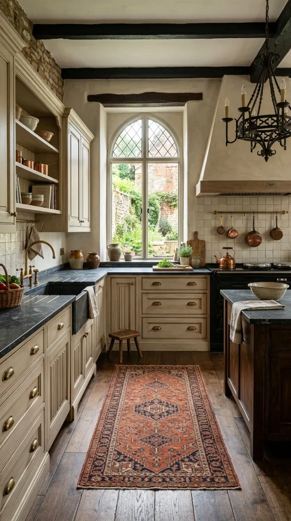
Antique parchment mimics aged manuscript paper, carrying subtle antiqued yellow and tan undertones that tell a visual story. It is an exceptional choice for historic home restorations, farmhouse kitchens, or any space desiring a curated, collected-over-time aesthetic.
- How to Make It: Tint a warm ivory base with raw umber and a hint of yellow oxide. Apply an optional light brown glaze into the recessed panel grooves to simulate natural aging.
- Design Variations: Pair with soapstone countertops, unlacquered brass bin pulls, and a vintage runner rug featuring faded terracotta and navy motifs.
14. Raw Cotton
Raw cotton represents the purest expression of organic neutrality. It is slightly warmer than pure brilliant white, carrying a soft, fluffy undertone reminiscent of unspun natural fibers. It creates an illusion of limitless space, making tiny apartments and galley kitchens feel expansive and airy.
- How to Make It: Use a pure acrylic white paint base tinted with a single drop of yellow ochre to banish blue or stark undertones. Apply with a fine-spray system for a glass-smooth finish.
- Design Variations: Complement with light oak open shelving, white subway tile with matching grout, and simple leather tab pulls.
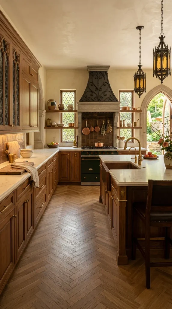
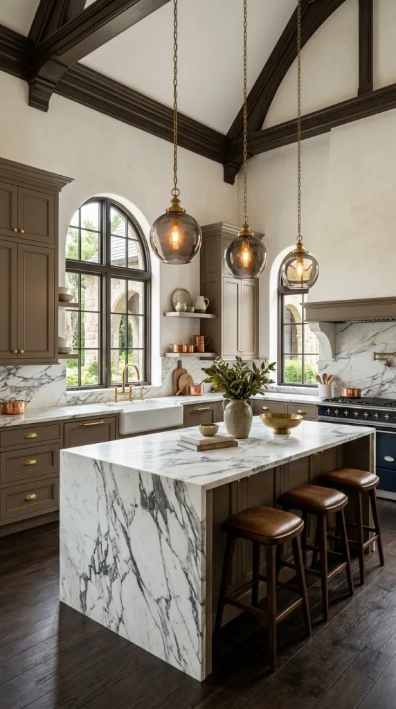
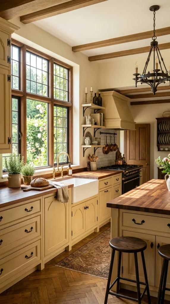
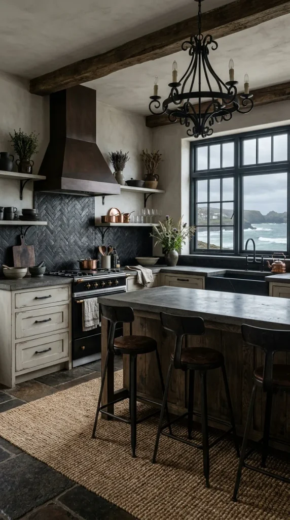
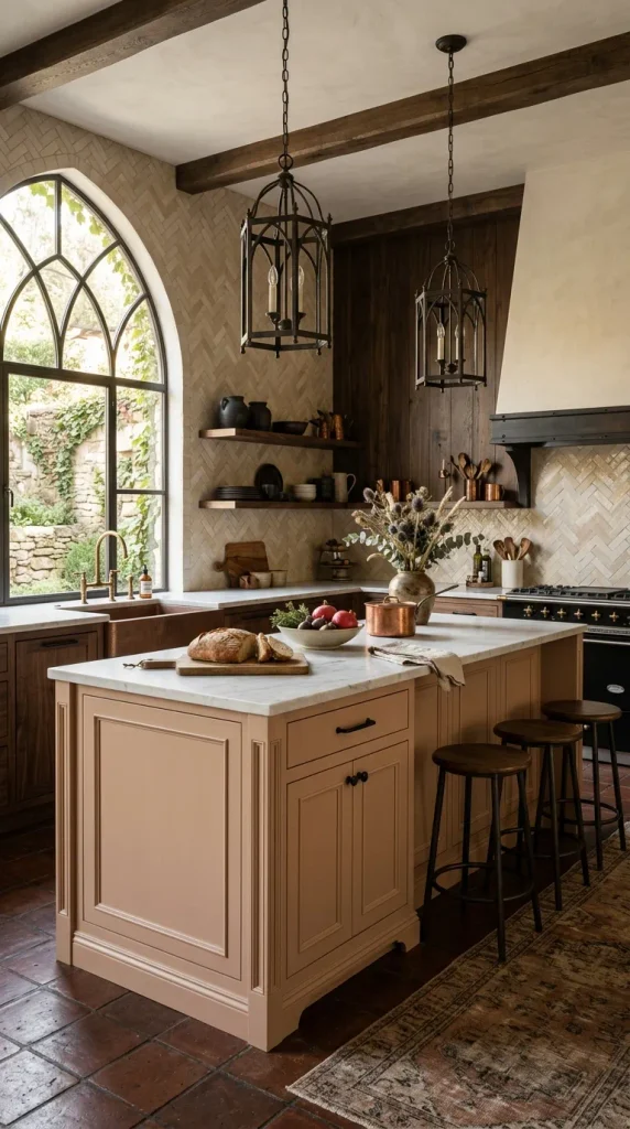
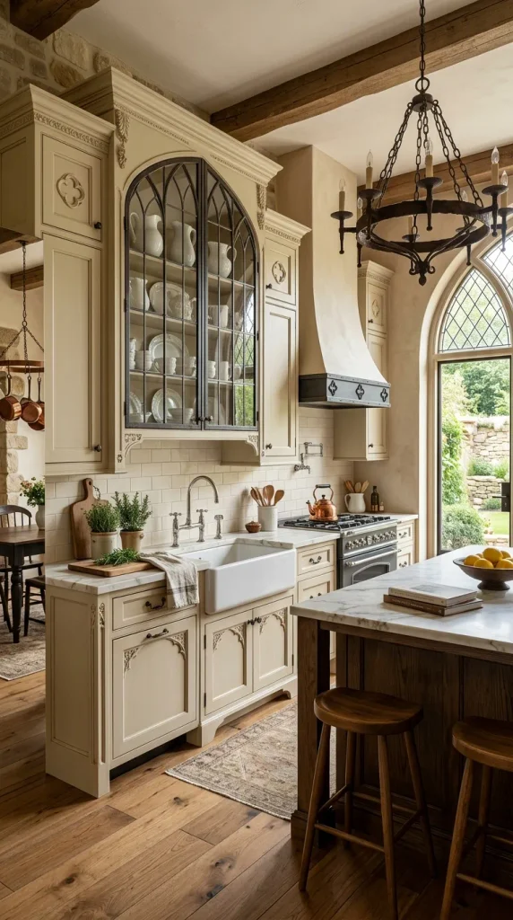
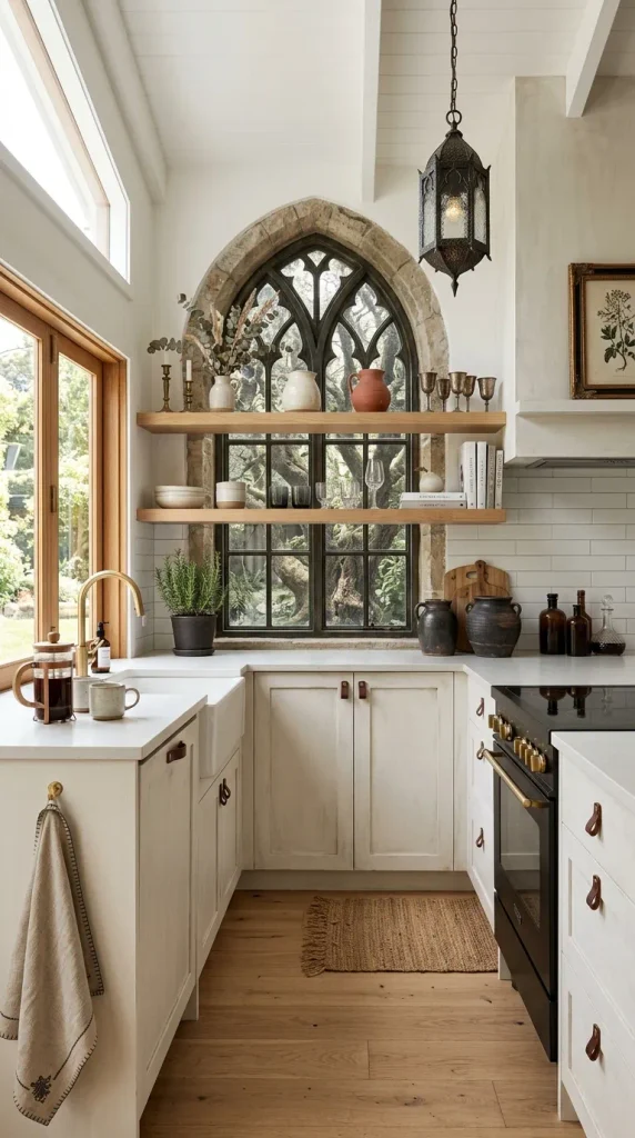
15. Muted Buttercream
Muted buttercream is a delightfully soft, pale yellow-beige that brings a subtle, uplifting warmth to cabinetry. It avoids the neon brightness of primary yellows, offering instead a sophisticated, buttery glow that infuses a kitchen with cheerfulness and hospitality.
- How to Make It: Mix a creamy white base with a delicate touch of yellow ochre and raw sienna. Finish with a satin protective clear coat.
- Design Variations: Style with honed Calacatta marble, polished chrome faucets to add a crisp modern edge, and glass-front cabinet doors displaying white ironstone collections.
16. Soft Terracotta Beige
Soft terracotta beige infuses earthy, baked-clay warmth into a neutral palette. It is a muted, sophisticated take on traditional rust, offering a sun-baked subtlety that feels both grounded and exotic. This shade works brilliantly as an accent color for kitchen islands paired with neutral perimeter cabinetry.
- How to Make It: Combine a warm beige base with burnt sienna and yellow ochre until the mixture achieves a dusty, sun-bleached clay appearance.
- Design Variations: Pair with zellige tiles in sand and cream, matte black hardware, and dark terracotta floor tiles sealed with a natural matte finish.
17. Warm Hazelnut
Warm hazelnut is a rich, delectable neutral that channels the comforting tones of roasted nuts and polished wood. It provides substantial visual weight and depth, making large kitchens feel intimate and cozy while adding luxurious warmth to modest spaces.
- How to Make It: Blend a deep beige base with significant amounts of raw umber and a touch of red oxide. Opt for a semi-gloss sheen to capture and reflect warm under-cabinet lighting.
- Design Variations: Combine with cream-colored quartz countertops, brushed brass plumbing fixtures, and white oak herringbone flooring.
18. Weathered Bone
Weathered bone is an organic, chalky neutral that mimics the appearance of sun-bleached animal bone and aged driftwood. It has a dry, matte character that feels wonderfully rustic and tactile, making it a favorite for modern farmhouse and coastal cottage aesthetics.
- How to Make It: Mix a light gray-beige base with white and a tiny hint of raw umber. Use a specialized chalk or mineral paint finish followed by a clear wax sealant for a velvety touch.
- Design Variations: Pair with concrete countertops, black iron hardware, and hand-knotted jute rugs to amplify the raw, tactile material palette.
19. Sunlit Straw
Sunlit straw is a luminous, pale golden neutral that captures the bright, airy feeling of a sunroom at midday. It infuses cabinets with a gentle, glowing warmth that makes food preparation feel bright and inspiring, even on gloomy winter days.
- How to Make It: Tint a warm white enamel base with yellow ochre and a whisper of raw sienna. Apply using professional spraying equipment for an impeccably smooth satin finish.
- Design Variations: Style with butcher block countertops, white ceramic farmhouse sinks, and brass gooseneck faucets.
20. Deep Camel Taupe
Deep camel taupe is a luxurious, sophisticated neutral that leans heavily into rich, saturated brown and golden undertones. It exudes tailored elegance, reminiscent of a fine leather coat or a bespoke cashmere sweater. It transforms standard kitchen cabinets into high-end architectural focal points.
- How to Make It: Combine a dark taupe base with rich doses of raw umber and golden yellow. Apply a durable conversion varnish in a satin finish to protect the deep color from scuffs and wear.
- Design Variations: Pair with white marble countertops with dramatic charcoal veining, polished unlacquered brass hardware, and smoked glass pendant lighting.
How to Make Warm Neutral Cabinets Work in Your Space
Achieving a professional, Pinterest-worthy result requires careful planning beyond selecting the paint color. Follow these essential tips to ensure your warm neutral kitchen cabinets look stunning and endure daily wear:
- Lighting Temperature Matters: Warm neutrals rely heavily on light interaction. Avoid cool LED bulbs (above 4000K), which can wash out yellow and red undertones, making cabinets look muddy or greenish. Opt for 2700K to 3000K warm white lighting to enhance the buttery, inviting glow of your paint choice.
- Incorporate Textural Contrast: Because warm neutrals sit comfortably in a similar tonal family, relying solely on color can make a kitchen feel flat. Introduce contrasting textures such as veined marble, rustic wood grains, fluted glass cabinet inserts, and handmade zellige tile backsplashes.
- Invest in Proper Prep Work: Cabinet painting success is 90% preparation. Clean surfaces thoroughly with TSP (trisodium phosphate), sand existing finishes to create a mechanical bond, apply a high-adhesion bonding primer, and use spray equipment rather than brushes to eliminate visible stroke marks.
- Test Swatches in Situ: Paint large samples on multiple cabinet doors and observe them at different times of day. Natural light shifts dramatically from morning to evening, and undertones that look beige in bright sunlight may flash pink or green under artificial evening lighting.
Future Additions & More Ideas
More ideas to come in future addition