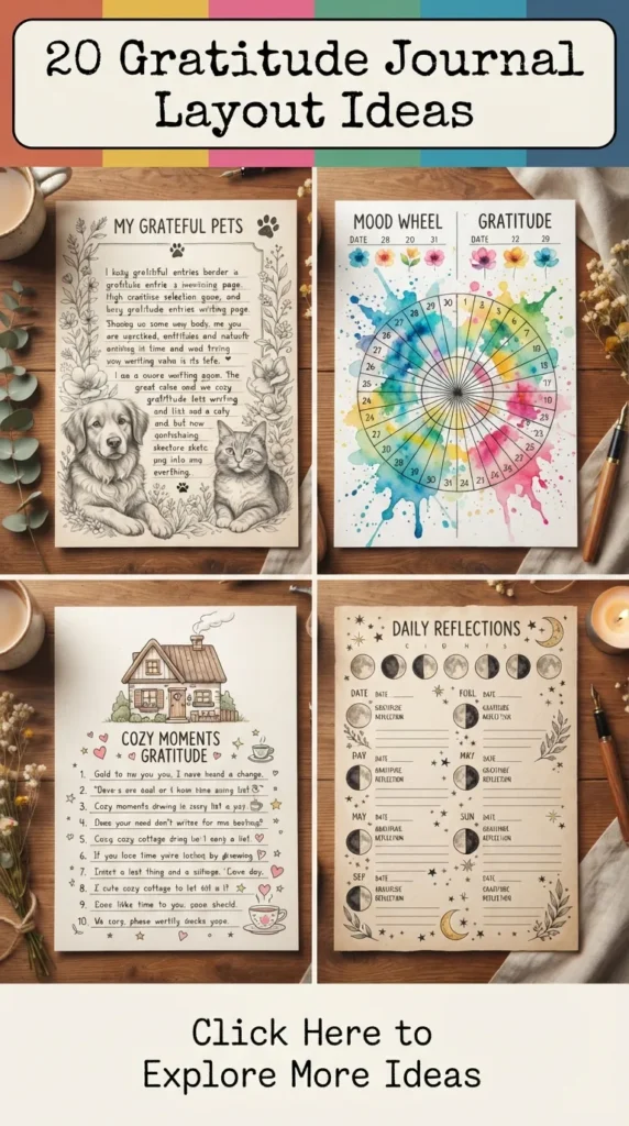
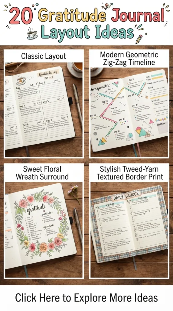
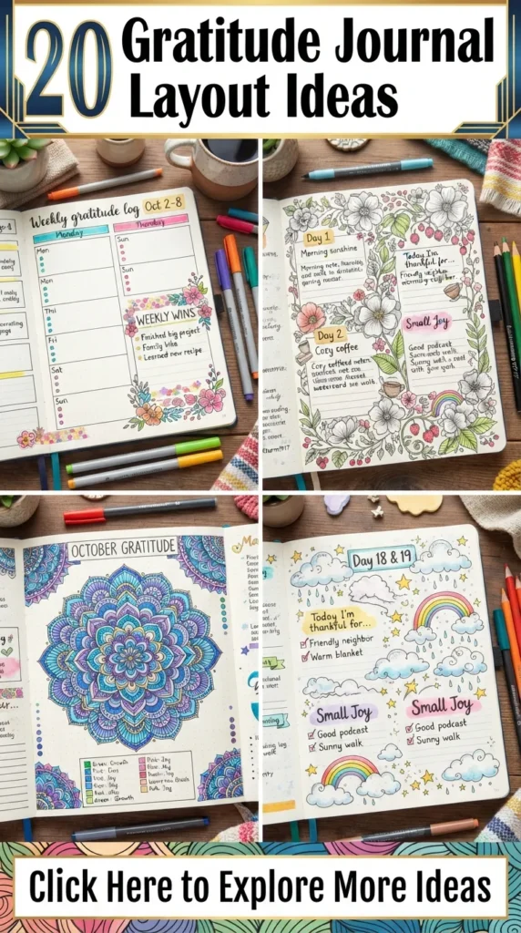
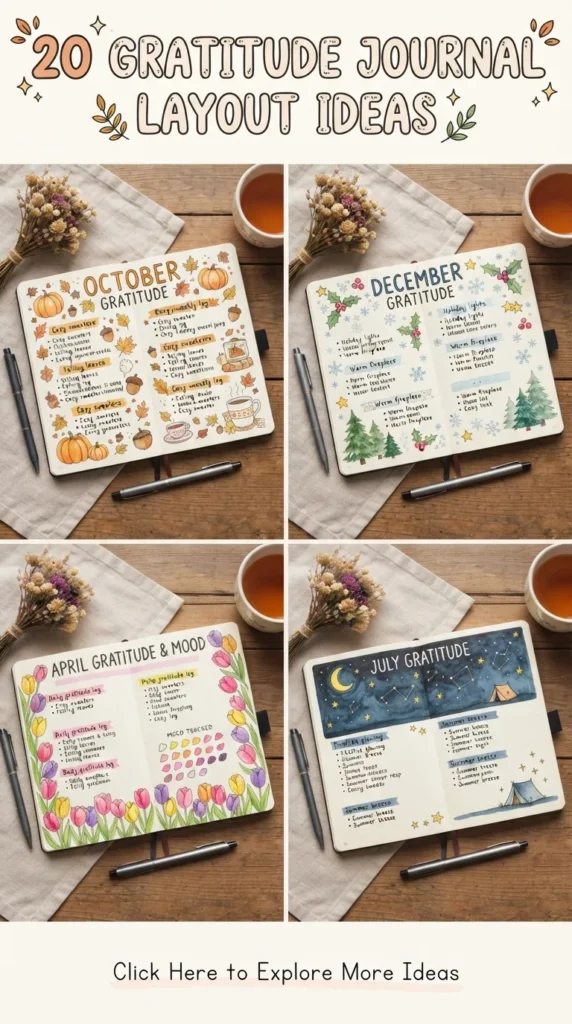
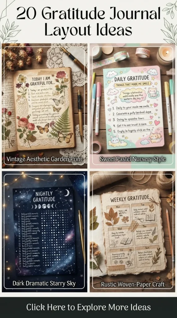
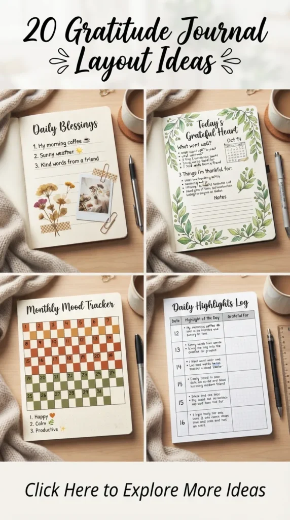
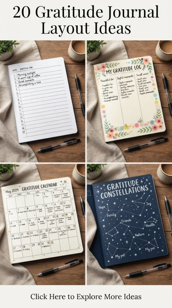
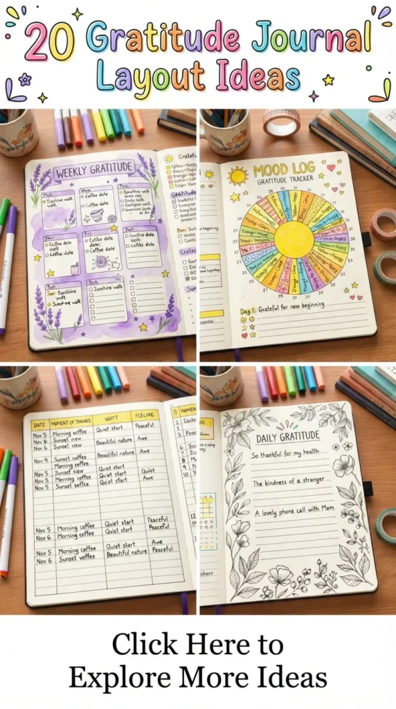
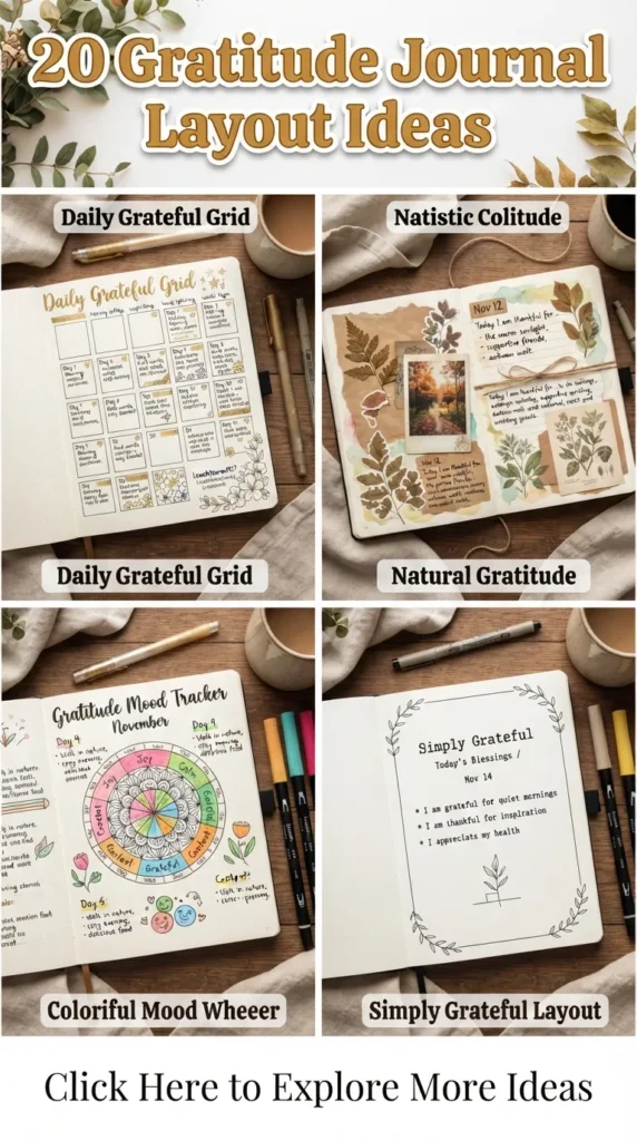
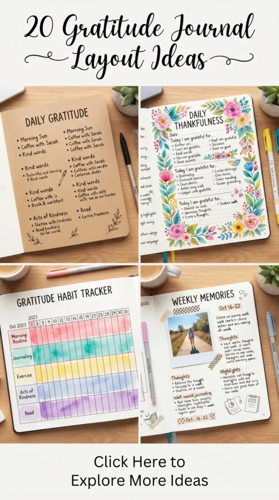
A gratitude practice shifts perspective from scarcity to abundance, and the layout of a journal serves as the visual framework that sustains this daily discipline. An intentional, well-structured journal spread does more than organize thoughts—it turns daily reflection into a tactile, aesthetic ritual. Modern journal design blends clean typography, thoughtful negative space, minimal grid systems, and subtle botanical or artistic accents to create pages that inspire mindful contemplation.
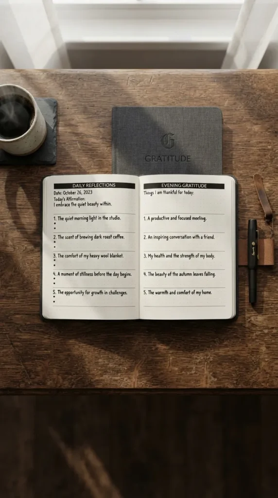
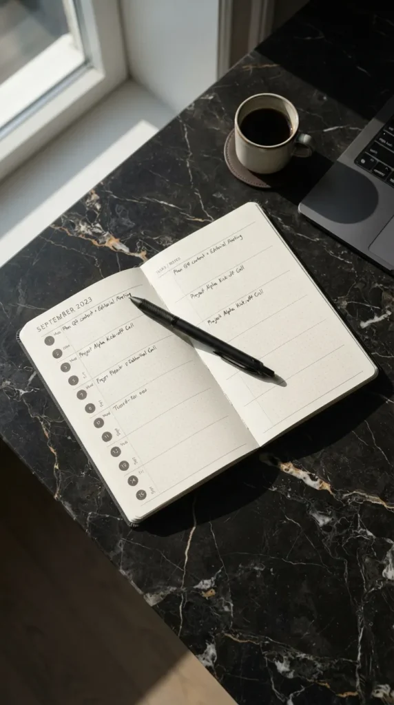
1. The Minimalist Linear Daily Log
A clean, distraction-free journal spread focused on clear horizontal flow and understated elegance.
- Introduction: The Minimalist Linear Daily Log strips away excessive embellishment in favor of clean horizontal sections, open whitespace, and refined typography. It is designed for those who appreciate visual clarity and quick, daily entries.
- What This Idea Means: This layout emphasizes clarity, function, and calm. By organizing thoughts into neat, sequential horizontal rows, it reduces cognitive overwhelm and makes gratitude tracking an effortless routine.
- How to Make It:
- Use a light dot-grid notebook (A5 size works best).
- Draw four to five slim horizontal dividers across the page using a 0.3mm black fineliner.
- Use simple, modern sans-serif lettering or a soft grey highlighter for headers like “Morning Reflection,” “Three Key Moments,” and “Evening Peace.”
- Leave ample blank margins around the text area to keep the layout feeling open and breathable.
- Tips & Variations:
- Add a subtle muted beige or taupe highlight bar behind each section header.
- Use simple bullet styles such as open circles, subtle dashes, or micro-dots instead of standard bullet points.
- Variation: Turn it into a 7-day linear weekly view on a single two-page spread.
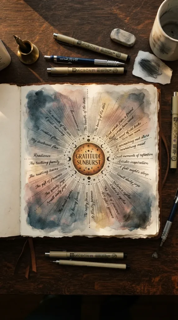
2. The Sunburst Radial Reflection Spread
A circular visual design where gratitude radiates outward from a central theme.
- Introduction: Departing from standard linear structures, the Sunburst Radial Reflection layout centers around a focal phrase and expands in circular rays across the page.
- What This Idea Means: A radial design symbolizes how gratitude emanates outward into all areas of life. It invites you to map your thoughts organically rather than strictly sequentially.
- How to Make It:
- Use a pencil and compass (or a round jar lid) to sketch a medium-sized circle in the center of a two-page spread.
- Write your primary anchor phrase or the date inside the circle using modern script calligraphy.
- Draw 8 to 12 light pencil guide rays extending from the circle toward the page edges.
- Write concise gratitude notes along these radiating lines using fine-tip black ink.
- Erase pencil guidelines once the ink dries thoroughly.
- Tips & Variations:
- Keep line weights delicate to maintain an airy aesthetic.
- Use soft pastel watercolors to create a gentle, transparent wash over the central sunburst.
- Variation: Assign each ray a specific life area (e.g., Relationships, Nature, Personal Growth, Small Comforts).
3. The Botanical Wreath Gratitude Frame
A delicate floral border framing heartfelt daily gratitude entries.
- Introduction: This layout uses hand-drawn botanical vines, eucalyptus leaves, or delicate fern fronds to border and celebrate written reflections.
- What This Idea Means: Incorporating nature-inspired elements brings calm, grounding energy to journaling, framing positive experiences within organic motifs.
- How to Make It:
- Lightly sketch an oval or rectangular boundary in the center of the page.
- Draw fine-line olive branches, eucalyptus stems, or delicate leafy vines around the border using an archival micro-pen.
- Fill the open center with your daily gratitude reflections, using clean paragraph alignment.
- Accentuate leaf details with soft sage green or olive watercolor washes.
- Tips & Variations:
- Keep the botanical lines thin and purposeful to let the written reflections remain the focal point.
- Pressed dried flowers attached with neutral washi tape can substitute for drawn borders.
- Variation: Draw four corner botanicals instead of a full wreath for a minimalist look.

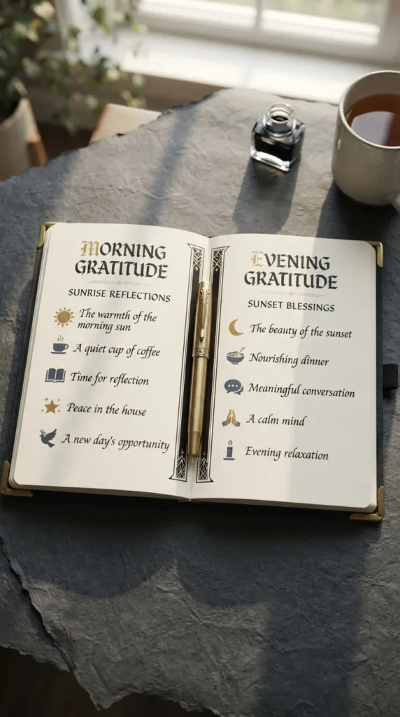
4. The 3-Tier Mindful Morning & Evening Split
A structured daily layout separating morning optimism from evening reflection.
- Introduction: A dual-column or split-page format that captures anticipatory gratitude in the morning and reflective gratitude before sleep.
- What This Idea Means: Gratitude works differently across the day. Morning entries set a positive tone and proactive mindset, while evening reflections offer closure and appreciation for lived moments.
- How to Make It:
- Split an A5 page into two distinct halves with a thin vertical or horizontal midline.
- Label the left (or top) section “Sunrise / Intentional Gratitude” and the right (or bottom) section “Sunset / Unsung Highlights.”
- Use numbered lists (1 to 3) in each half for concise, focused entries.
- Add a tiny sun icon in soft gold ink and a moon icon in muted navy.
- Tips & Variations:
- Include a single line for “Lesson Learned” in the evening section to reframe challenges.
- Use warm earth tones for the morning block and cool slate tones for the evening block.
- Variation: Use a two-page spread where the left page represents the morning routine for the week and the right represents the evenings.
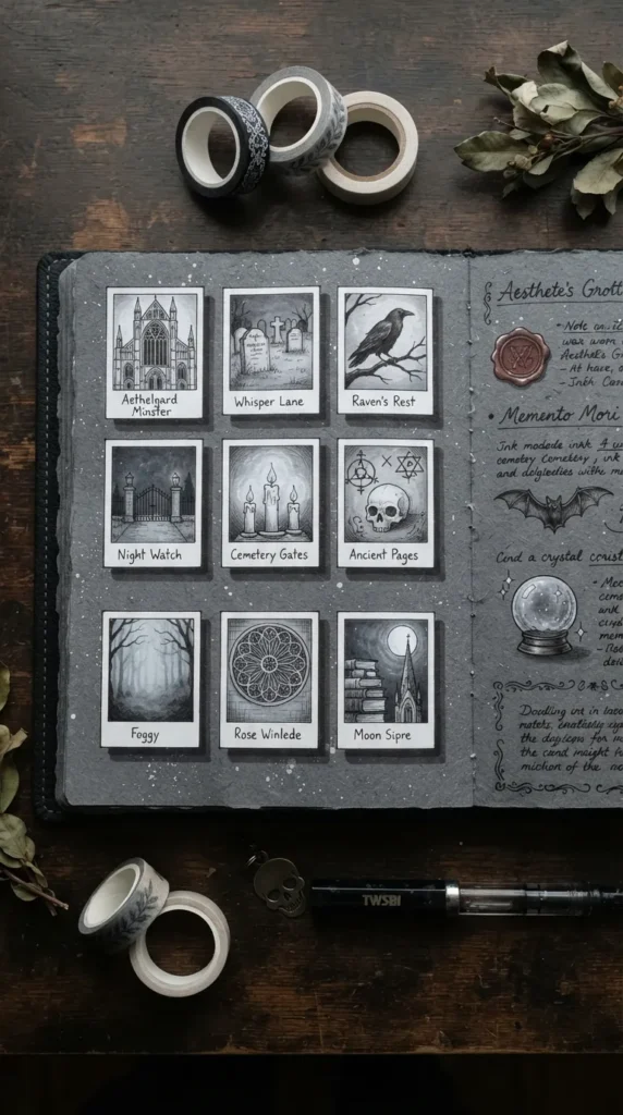
5. The Neutral Aesthetic Polaroids Grid
A visual memory grid styled like a collection of mini snapshot photos.
- Introduction: Mimicking vintage instant film, this spread features structured squares designed to preserve micro-moments as if they were framed photographs.
- What This Idea Means: Framing specific experiences like photos turns abstract gratitude into tangible, vivid memories.
- How to Make It:
- Draw four to six identical rectangular cards (approx. 2.5 x 3 inches) across a two-page spread, leaving a thicker bottom border like an instant photo.
- In the top square of each frame, draw a tiny minimalist line sketch of a moment, or write a single-word memory.
- On the bottom white tab of each frame, write a one-sentence gratitude caption.
- Add a drop-shadow effect using a soft cool grey marker (e.g., Tombow N75) for depth.
- Tips & Variations:
- Paste actual miniature portable printer photos (like ZINK prints) into the squares for a multimedia look.
- Keep borders clean and use architectural, modern lettering on the photo tabs.
- Variation: Use grid washi tape across the corners of each card to simulate an attached scrapbook aesthetic.
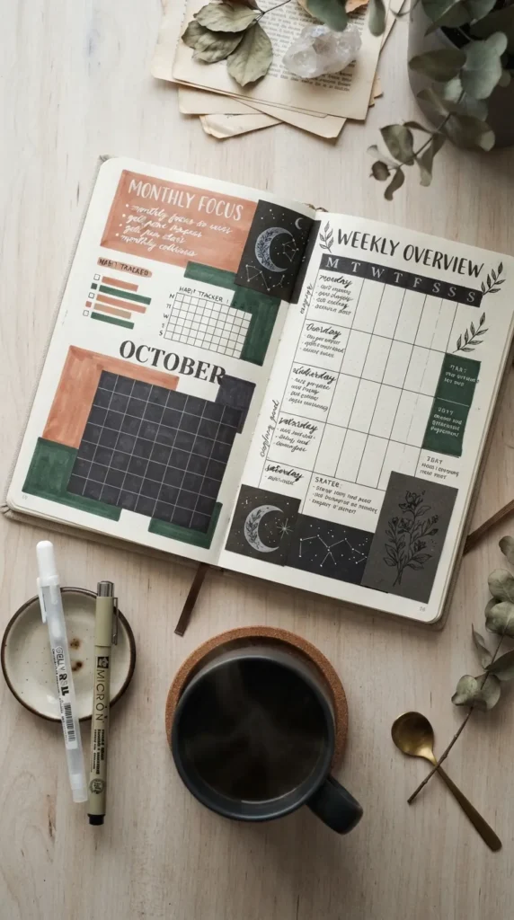
6. The Earth-Toned Color Block & Typography Spread
A Scandinavian-inspired design using muted geometric blocks and bold typography.
- Introduction: Clean geometry meets warm terracotta, oat, olive, and clay tones, organizing gratitude entries into structured color blocks.
- What This Idea Means: Color psychology plays a significant role in mindfulness. Warm, grounded earth tones evoke warmth, stability, and peaceful focus.
- How to Make It:
- Create 3 to 4 distinct geometric rectangular sections across the page using muted brush markers (terracotta, warm sand, sage, dusty mauve).
- Inside each colored block, write your gratitude entries using crisp white gel pens or dark charcoal pigment pens.
- Emphasize the first word of each sentence in bold serif lettering.
- Tips & Variations:
- Ensure high contrast between ink color and the background block for easy legibility.
- Leave wide white margins around the color blocks to maintain a modern aesthetic.
- Variation: Use textured, recycled kraft paper scraps pasted into the notebook as the organic background blocks.

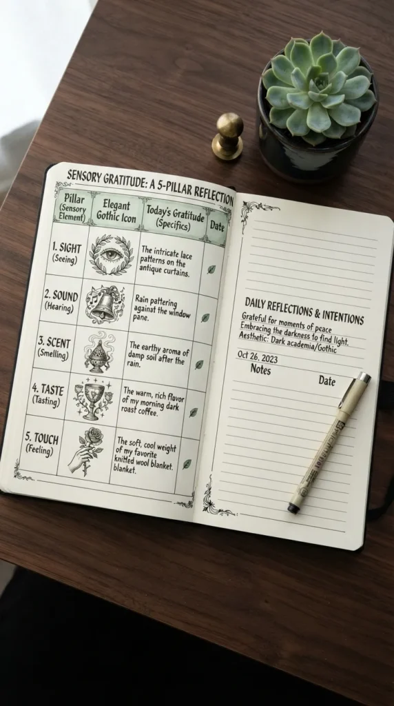
7. The Sensory Gratitude 5-Pillars Matrix
A holistic spread capturing gratitude across all five human senses.
- Introduction: A systematic table that invites reflection on what you saw, heard, smelled, tasted, and touched throughout the day.
- What This Idea Means: Grounding gratitude in sensory experiences connects your practice directly to the physical world, enhancing mindfulness and presence.
- How to Make It:
- Draw a 5-row table across a two-page spread with modern, thin borders.
- Label each row with an elegant icon and header: Sight, Sound, Scent, Taste, Touch.
- Write descriptive, vivid entries in each row (e.g., “The aroma of freshly ground dark roast coffee,” “The soft weight of a wool blanket”).
- Use a subtle pastel highlighter to accent sensory keywords.
- Tips & Variations:
- Focus on micro-details rather than broad statements to sharpen your sensory awareness.
- Use minimalist line icons for the eyes, ears, nose, tongue, and hands.
- Variation: Combine this layout into a circular radar-style wheel with five equal wedges.
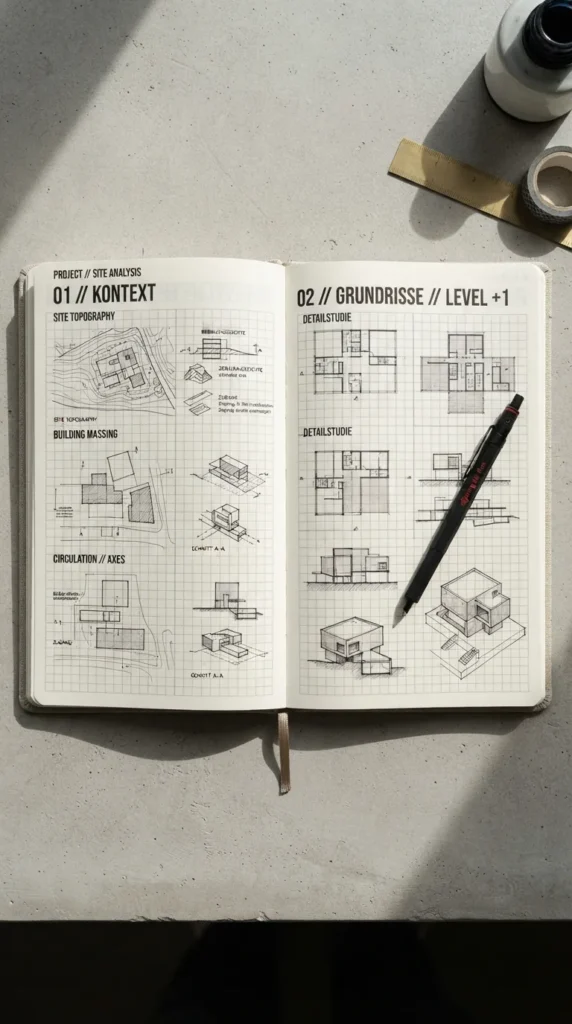
8. The Modern Architectural Grid & Golden Ratio Layout
A layout inspired by architectural blueprints and Swiss graphic design principles.
- Introduction: A precision-driven spread using clean modular grids, balanced asymmetry, and refined editorial typography.
- What This Idea Means: Structure brings order to busy thoughts. This design treats journal entries like an editorial publication, prioritizing balance and harmony.
- How to Make It:
- Use a dot-grid notebook to divide the page into asymmetric modular columns (e.g., 2/3 main column, 1/3 sidebar).
- Use fine black pens with rigid rulers for straight divider lines and neat text boxes.
- Use bold all-caps sans-serif headers with wide letter-spacing (k e r n i n g).
- Place long-form reflections in the main column and concise numeric metrics (e.g., “Daily Joy Index: 9/10”) in the sidebar.
- Tips & Variations:
- Keep lines crisp; use technical drawing pens (0.1mm and 0.5mm).
- Use a single accent color—like architectural cyan or mustard yellow—sparingly.
- Variation: Incorporate subtle blueprint grid patterns in light grey ink across the background.
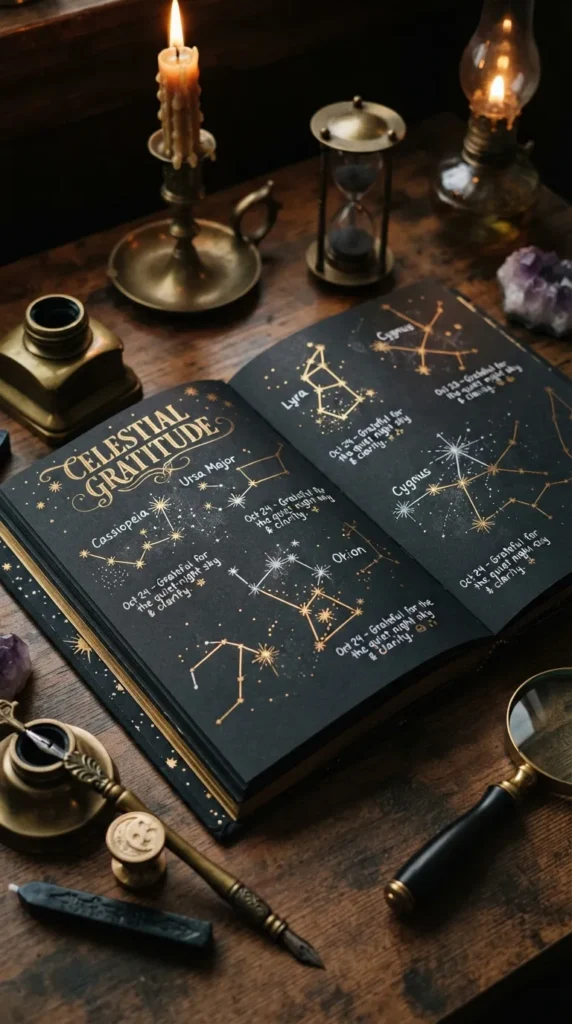
9. The Constellation Night Sky Gratitude Map
A celestial-themed layout connecting moments of appreciation like stars in a night sky.
- Introduction: A celestial layout where moments of gratitude are mapped as stars and connected to form a constellation across the page.
- What This Idea Means: It reframes positive experiences as guiding lights shining in the dark, symbolizing how small joys connect to form a beautiful whole.
- How to Make It:
- Use a dark navy or deep charcoal watercolor wash across the page, or use a black-out paper journal.
- Plot 5 to 10 golden or white metallic dots across the spread to represent individual gratitude moments.
- Draw faint metallic or white lines connecting the dots to form an abstract personal constellation.
- Write short, poetic gratitude notes next to each star using an opaque white or gold gel pen.
- Tips & Variations:
- Vary star sizes to reflect the magnitude of each experience.
- Add tiny metallic starbursts and moon phase accents in the margins.
- Variation: Map your entries to actual astronomical constellations (e.g., Ursa Major, Orion, Cassiopeia).
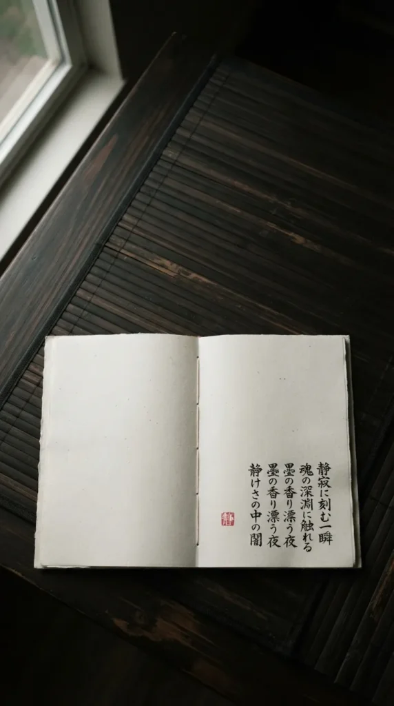
10. The Japanese Ma (Negative Space) Minimalist Spread
A Zen-inspired spread honoring the beauty of emptiness and deliberate, intentional entries.
- Introduction: Based on the Japanese aesthetic concept of Ma (negative space), this layout uses generous blank areas to emphasize a single, profound reflection.
- What This Idea Means: Mindfulness is not about filling every empty space. Giving your words generous visual breathing room honors the depth and value of each thought.
- How to Make It:
- Leave at least 70% of the two-page spread completely blank.
- Place a single, carefully worded gratitude statement in the lower right third of the spread.
- Write with a fine fountain pen or sumi calligraphy ink brush.
- Add a subtle red stamp seal (Hanko style) or a single pressed leaf in the upper margin for visual balance.
- Tips & Variations:
- Focus on quality over quantity: one deep reflection often resonates more than an extensive list.
- Use high-quality, heavy-weight cotton or bamboo paper to celebrate the tactile paper texture.
- Variation: Add a single vertical line of elegant handwritten text alongside a horizontal entry.
11. The Vintage Ephemera Collage & Gratitude Envelope
A rich, tactile multimedia spread combining collected keepsakes, envelopes, and layered textures.
- Introduction: A layered scrapbook layout using vintage stamps, tickets, kraft envelopes, and handwritten notes to preserve tangible reminders of gratitude.
- What This Idea Means: Tangible artifacts anchor memories in physical reality, making everyday gratitude tactile, multi-dimensional, and nostalgic.
- How to Make It:
- Affix a small translucent vellum or kraft paper envelope to the journal page using double-sided adhesive.
- Layer vintage book pages, muted washi tapes, and postal stamps around the envelope.
- Write your personal gratitude list on a small, folded linen paper card and slip it inside the envelope.
- Write a preview reflection or notable date directly on the envelope flap.
- Tips & Variations:
- Save real-world ephemera like transit tickets, café receipts, or museum passes to tuck inside the envelope.
- Seal the envelope flap with a faux wax seal sticker or a tiny brass clip.
- Variation: Create a spread with three small envelopes labeled “People,” “Places,” and “Victories.”
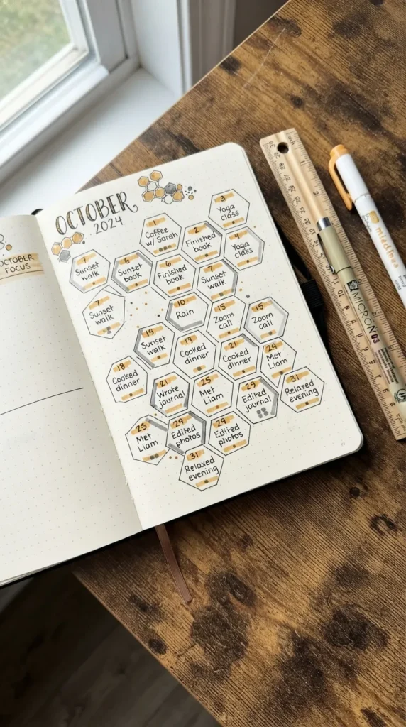
12. The Monthly Hexagonal Honeycomb Gratitude Tracker
A geometric monthly overview tracking daily gratitude in interconnected honeycomb cells.
- Introduction: A visually appealing monthly layout consisting of 30 or 31 interlocking geometric hexagons, creating a cohesive honeycomb pattern.
- What This Idea Means: Gratitude is built day by day. Watching the geometric cells fill over a month provides a rewarding visual representation of consistent appreciation.
- How to Make It:
- Use a hexagonal stencil or a ruler to draw an interconnected honeycomb cluster of 30 to 31 cells across a two-page spread.
- Number each hexagon in small, clean digits in the upper corner.
- Write a condensed 3- to 5-word highlight of the day inside each cell.
- Color in completed cells with varying shades of warm amber, honey, and oat markers.
- Tips & Variations:
- Use a subtle metallic gold gel pen for cell borders to add warmth.
- Keep entries concise so the text fits comfortably within each hexagon.
- Variation: Color-code cells by category (e.g., yellow for personal growth, sage for nature, pink for relationships).
13. The One-Line-A-Day Vertical Column Flow
A streamlined multi-week layout designed for sustainable, quick daily reflections.
- Introduction: A vertical multi-column layout that captures a single sentence of gratitude every day across an entire week or month.
- What This Idea Means: Consistency is the foundation of habit formation. Reducing the barrier to entry with a single line per day keeps your practice active even during busy seasons.
- How to Make It:
- Divide a two-page spread into 7 vertical columns (for a week) or 4 columns (for a month).
- Add bold, minimalist date headers at the top of each column using a dark pigment liner.
- Use light grey horizontal dotted lines as writing guides down each column.
- Write one meaningful sentence per day focusing on the most memorable moment.
- Tips & Variations:
- Highlight the date numbers with a soft pastel circle marker.
- Maintain clean margins at the top and bottom for a neat, editorial look.
- Variation: Expand the page count into a 3-year or 5-year comparison format to compare the same day across different years.
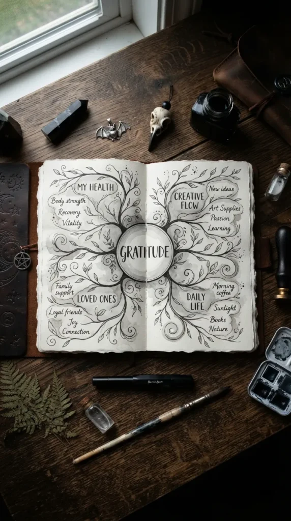
14. The Flowing Stream Mind-Map Gratitude Layout
An organic, non-linear spread that connects interrelated moments of gratitude like branches of a river.
- Introduction: An open-format concept that abandons boxes and tables in favor of flowing lines, interconnected bubbles, and branching thoughts.
- What This Idea Means: Life rarely happens in rigid rows. An organic mind-map lets your reflections branch naturally from one realization to the next.
- How to Make It:
- Write a central positive experience in the middle of the spread inside a soft oval or cloud shape.
- Draw curving, organic branch lines extending from the center toward the page borders.
- Along each branch, write related elements you are grateful for (e.g., Central: “Family Dinner” -> Branch 1: “Laughter over dessert” -> Branch 2: “Deep conversation on future plans”).
- Use varied line weights and subtle dot accents to create depth.
- Tips & Variations:
- Use flowing script calligraphy for main headings and clean print for sub-branches.
- Incorporate soft watercolor washes along the paths of the branches.
- Variation: Frame the mind-map around a specific theme, such as “Career Milestones” or “Creative Milestones.”


15. The Editorial Serif Magazine-Style Spread
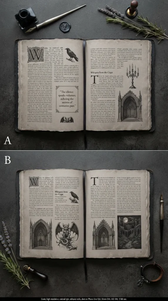
A high-fashion, publication-inspired spread characterized by bold serif headers and multi-column typography.
- Introduction: Inspired by luxury print magazines, this layout combines bold typography, asymmetric columns, and clean borders to turn your journal into a personal publication.
- What This Idea Means: Treating your thoughts with the elegance of an editorial publication elevates the value you place on personal reflection.
- How to Make It:
- Draw two distinct vertical columns per page with a 1-inch outer margin.
- Create a prominent headline across the top of the spread in classic serif lettering (e.g., “GRATITUDE: ISSUE NO. 8”).
- Use drop-caps (large, stylized initial letters) at the start of each reflection paragraph.
- Include a small “Pull Quote” box with a light grey border to highlight the week’s most meaningful takeaway.
- Tips & Variations:
- Use classic black, off-white, and charcoal tones for a timeless editorial aesthetic.
- Add subtle horizontal rules above and below section headers.
- Variation: Add a small faux barcode stamp or print label in the lower corner for an authentic magazine feel.
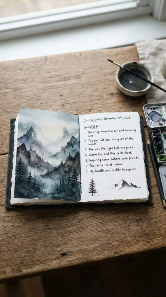
16. The Silhouette Watercolor Horizon Spread
A vibrant, artistic spread featuring loose landscape watercolor silhouettes paired with minimal gratitude notes.
- Introduction: This spread blends soft watercolor landscapes—such as mountain ranges, ocean horizons, or rolling hills—with quiet spaces for written reflection.
- What This Idea Means: Visual beauty stimulates relaxation. Blending art and writing provides a creative outlet that supports mindful contemplation.
- How to Make It:
- Use a wet-on-wet watercolor technique to lay down a soft sunset or mountain gradient across the top third of the spread.
- Once dry, use a dark fine-liner to paint a simple black silhouette of pines or hills along the color horizon.
- In the spacious lower two-thirds of the page, write your gratitude entries in neat, organized rows.
- Leave ample whitespace between the painted horizon and your writing.
- Tips & Variations:
- Use cold-press watercolor paper journals (200+ GSM) to prevent page buckling.
- Keep paint tones muted (dusty blues, peaches, and moss greens) to maintain an understated aesthetic.
- Variation: Paint a coastal ocean horizon with gentle sea foam lines made with a white gel pen.
17. The People & Relationships Tribute Circle
A focused gratitude layout dedicated to the individuals who inspire, support, and nurture you.
- Introduction: A relationship-centered layout structured around portrait frames, name cards, and specific words of appreciation for friends, family, mentors, and peers.
- What This Idea Means: Interpersonal connection is a profound driver of well-being. Dedicating space specifically to the people in your life deepens empathy and strengthens bonds.
- How to Make It:
- Divide a two-page spread into four to six distinct rectangular cards or circular frames.
- Inscribe a name at the top of each card in delicate cursive script.
- Below each name, list three specific reasons you are grateful for that person: an act of kindness, a shared memory, and a quality you admire.
- Accent each card with a soft floral sprig or a subtle washi tape border.
- Tips & Variations:
- Include unexpected people, such as the barista who smiles every morning or an author whose work inspired you.
- Add a tiny check-box for “Sent them a note of thanks today.”
- Variation: Add small passport-style photos of your loved ones within the frames.
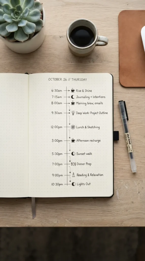
18. The Micro-Moments Dotted Grid Timeline
An hour-by-hour visual timeline recording small moments of joy throughout a single day.
- Introduction: A vertical timeline tracking micro-moments of happiness, peace, and appreciation as they unfold from morning to night.
- What This Idea Means: Big achievements are rare, but small joys happen continuously. A timeline trains your mind to notice and savor subtle moments of happiness in real time.
- How to Make It:
- Draw a clean vertical line down the center of the page with hours marked along it (e.g., 07:00, 10:00, 13:00, 16:00, 19:00, 21:00).
- Draw branch lines to the left and right alternating by hour.
- At each timestamp, record a small moment of gratitude (e.g., “07:30: Sunlight casting geometric shadows on the kitchen floor”).
- Use delicate icons (coffee cup, open book, sunshine, audio wave) next to each timestamp.
- Tips & Variations:
- Use a 0.2mm pen for ultra-fine lines and sharp detail.
- Keep entries limited to a single specific line to capture the exact feeling of the moment.
- Variation: Spread the timeline across an entire weekend from Friday evening to Sunday night.
19. The Abundance & Inner Peace Affirmation Portal
A spiritual, geometric mandala-inspired spread merging gratitude with affirmative self-reflections.
- Introduction: A layout blending sacred geometry, arched doorway motifs, and affirmative gratitude statements to create a peaceful, meditative space.
- What This Idea Means: Gratitude for who you are and what you possess naturally manifests inner calm. An architectural arch motif symbolizes an entryway to peace and presence.
- How to Make It:
- Draw a classic architectural archway in the center of the spread with a fine-point ruler and compass.
- Frame the interior of the arch with delicate geometric line art or radiating stippled dots.
- Inside the arch, write a core gratitude affirmation (e.g., “I am grounded in gratitude for the abundance of this present breath”).
- Use the space outside the archway for supporting daily reflections and thoughts.
- Tips & Variations:
- Use subtle metallic gold ink along the inner line of the arch for a luminous effect.
- Pair the arch with soft, minimalist botanical vines climbing up its exterior pillars.
- Variation: Create a triptych of three smaller side-by-side arches across the spread.
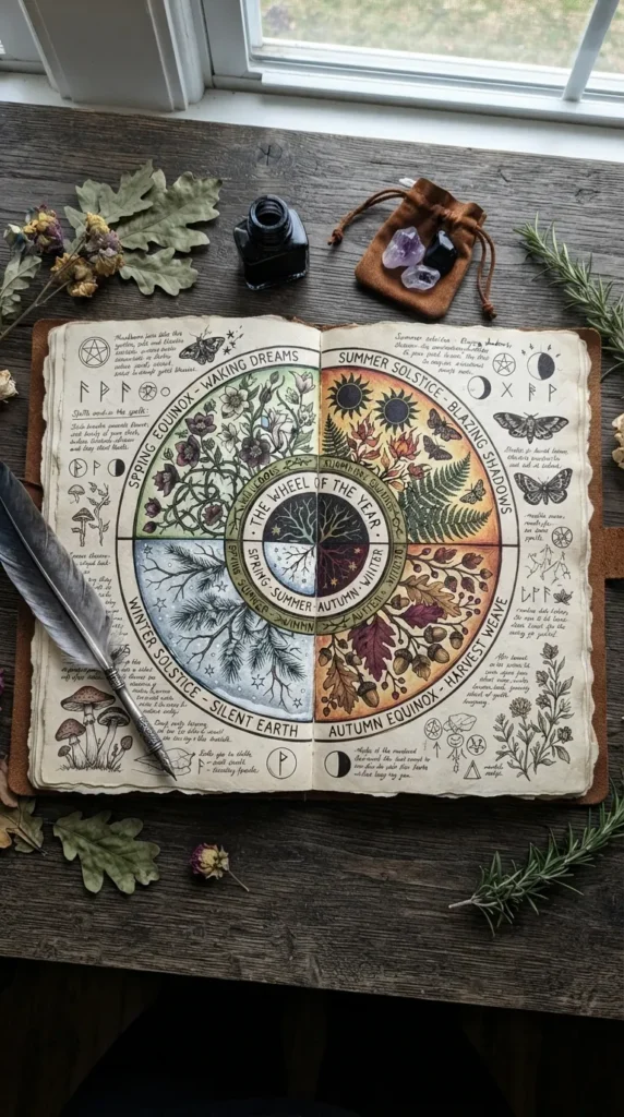
20. The Seasonal Transition Wheel of Gratitude
A cyclical layout celebrating the unique textures, scents, and gifts of the changing seasons.
- Introduction: A large circular wheel spread divided into seasonal quadrants (or monthly wedges) dedicated to appreciating nature’s shifting cycles.
- What This Idea Means: Aligning gratitude with the natural rhythm of the seasons fosters an appreciation for change, growth, harvest, and rest.
- How to Make It:
- Draw a large circle covering the majority of a two-page spread.
- Divide the wheel into four distinct quadrants representing Spring, Summer, Autumn, and Winter (or current seasonal phases).
- Decorate each quadrant’s outer rim with tiny seasonal motifs (blossoms for spring, sun rays for summer, fallen leaves for autumn, snowflakes or pinecones for winter).
- Write reflections inside each quadrant highlighting seasonal joys (e.g., crisp autumn air, fresh summer fruit, cozy winter fires).
- Tips & Variations:
- Use a distinct seasonal color palette for each quadrant (pastels, bright yellows, warm ambers, cool blues).
- Write in curved concentric lines inside the circle for a striking visual rhythm.
- Variation: Focus on a single season and divide the circle into 12 weeks of seasonal observations.